
Components
The component library
In short
To reuse what a site already has, you have to know what it has and where it is used, and the site shows neither in one place. The component library lists everything the site’s own core says it can place, pictures each piece in the site’s theme and says where the site uses it, so you or an agent can place a real one instead of building another.
On this page
Why it exists
A theme’s folder lists files, not what they look like. Nothing in it says which pages use a component, or which blocks a page could take. So a new card gets built beside the old one, and an agent asked for “a card” writes yet another.
The library answers three questions in one place: what can this site place, what does each piece look like here, and where is it used. From there you can drag a piece onto the page, open its files, or hand its exact id to an agent.
What it lists
The library is what the site’s own core lists, read through the site helper. It names no module, plugin or theme, so whatever is built on core shows up: core’s pieces, your theme’s and your modules’ or plugins’.
| Kind | Platform | What it is |
|---|---|---|
| Components | Drupal | Single-directory components: each keeps its Twig template and a .component.yml that describes its props and slots in one folder, with its styles and scripts when it has them. |
| Blocks | Drupal | The blocks core’s block library offers, with anything a block needs from the page it sits on (such as entity:node). |
| Blocks | WordPress | Every registered block type, with its attributes and whether it has an example. |
| Patterns | WordPress | Ready-made arrangements of blocks, with the block types each is for. |
| Block styles | WordPress | A named look a block type can switch to, such as Fieldnotes’ “Text with arrow” for a button. |
It needs the site helper, version 4 or newer. With an older one, the library says “Helpers before version 4 have no library: updating it adds the list and the pictures, and changes nothing else in the site.”, with Update the helper… beside it.
Open the library
Open Add
Press On a Mac, ⇧B; on Windows and Linux, Shift+B in the live view, or choose Add in Structure, the panel on the left. Opened by its key, the keyboard goes straight to the library’s search, and On a Mac, ⇧B; on Windows and Linux, Shift+B again goes back to the tab you came from. When the page’s trace also lists what this page itself can take, a switch at the top offers Library and This page.
Structure’s Add tab on a Northstar product page, Studio design: the line “What this Drupal site can place, as its core lists it” with its components and blocks counted, the search box, and the Components group with a small phone-width picture beside each name.. Current beta · demo 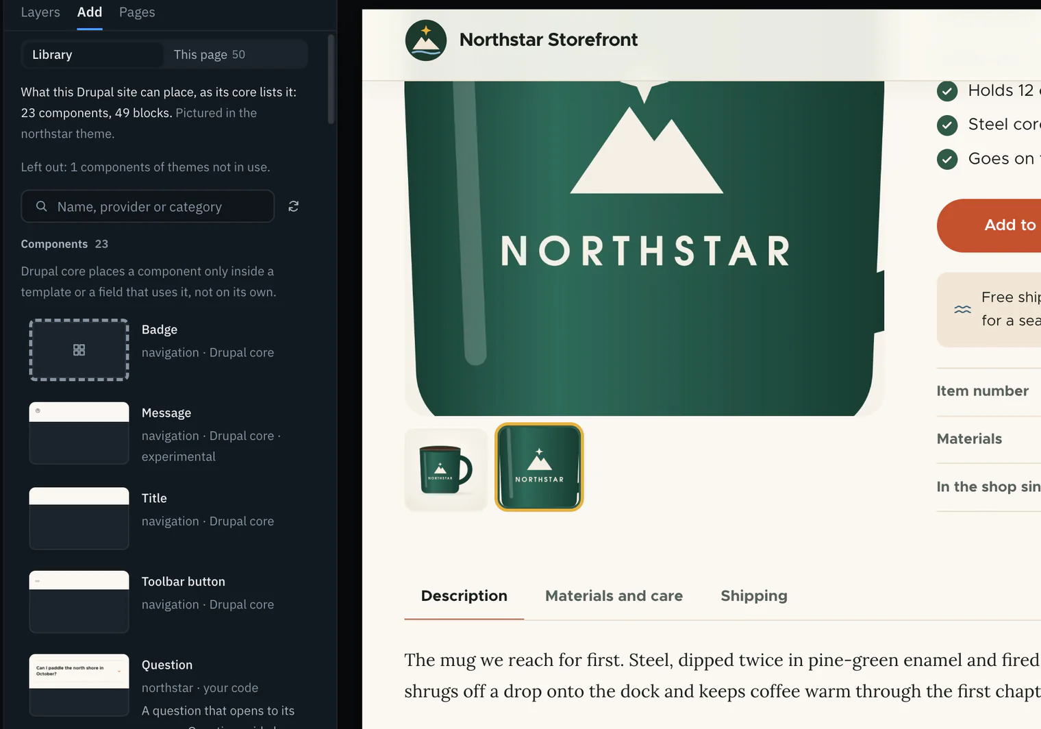
Find a piece
Each kind is a group with its count: Components and Blocks on Drupal; Blocks, Patterns and Block styles on WordPress. A row shows a small picture at a phone’s width, the name, where it comes from (its module, plugin or theme, and whether it is your code, contributed or core) and its description. Type in Name, provider or category to keep the rows that match every word.
Open one
Click a row for its details: its pictures, its id with Copy its id, its category and status, then Add it to this page, Across the site and On this page, its props, its slots and its files. Esc or the back arrow returns to the list; Esc on the list closes Add.
Northstar’s Front page shipping callout block opened in the library: its desktop and phone pictures side by side at one scale, the line saying the site rendered it alone with its default settings, its id with Copy, and the Add it to this page and Across the site sections below.. Current beta · demo 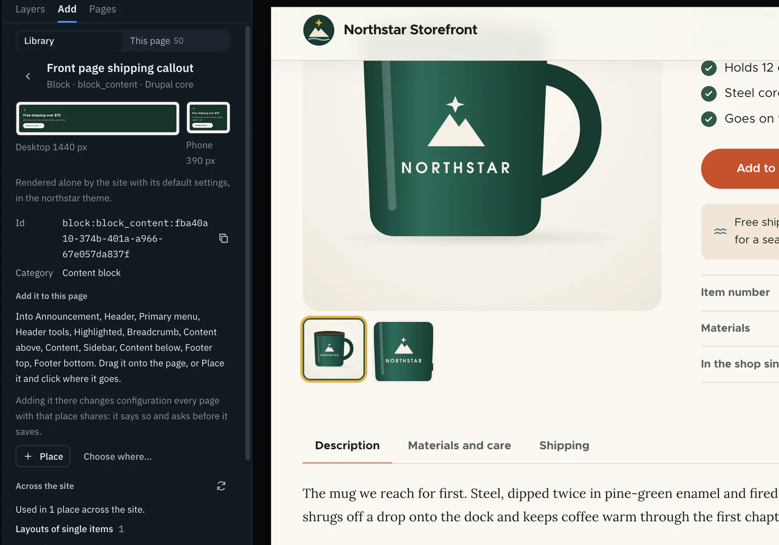


Pictured in your theme
A name does not tell you how a piece looks on this site. Each entry is rendered alone by the site itself, in its own theme, at 390 px (a phone) and 1440 px (a desktop). The two pictures sit side by side at the same scale; click one to see it larger.
- What fills it is said under the pictures: the component’s own examples, else its props’ defaults, else a placeholder for each prop it requires; a block’s example or its default settings; a pattern as it is written.
- Only the entries you scroll to are pictured, a few at a time, so a long library is not rendered all at once.
- Pictures are kept in Wanigan’s own data folder until a definition or one of its files changes, and then taken again. Opening the library again reuses them.
- An entry that cannot be pictured says why instead, such as a block that needs content from the page it sits on.
- A piece taller than a picture keeps is cut at the bottom, and its label says so.
Props, slots and files
A component is made to be filled in. Its props are the values it takes, such as an address or a choice of look. Its slots are the places it takes other content, such as a picture or a heading. The library reads both from the component’s own description, so you see what it accepts before you use it.
- Each prop shows its name, its type, its title and description, its default and the values it may take (“One of”). A
*marks one it requires. - On WordPress a block type’s settings are its Attributes, listed the same way.
- Slots are listed with their titles and descriptions.
- Files lists the files that define it. Each opens in the code editor, the dock’s Code tab beneath the page, when it is in the folder the site serves; otherwise it is only named, with a button to copy its path.
Northstar’s Product card, for instance, requires an address (url) and takes a category, whether it has badges, and a look (default or compact). Its slots are its picture, name, price and badges.
A component’s props form is not built yet: you can read the props here, but not fill them in to try the component.
Where it is used
Before you change a piece, or reuse it, you want to know where else it shows. The library asks the site.
Open Across the site
In an entry’s details, Across the site asks the helper to search what the site has stored. It reads only, and answers with a line that counts the places (“Used in 4 places across the site.”), then the places grouped by kind.
Across the site for Northstar’s Product card: the line counting where it is used, the Templates group naming the product teaser template with its file, and “What this search cannot see” listed under it.. Picture to come Picture: to come
A screenshot of the real app, with the demo’s data, of what the title above says.
Open a place
A place’s name opens the page that shows it in the live view, when one does. Change it opens the site’s own page for changing it, such as a block placement’s settings. Beside each: where in it (a region, a section, a template’s line), what it is reached through (a synced pattern, a template part), its file, and anything worth knowing, such as switched off, a theme not in use or a draft.
Read what it cannot see
Under the places, What this search cannot see is always listed, because a search of stored data cannot know what code renders. What it searched lists each source and how long it took. When the search did not finish, the count says “it reached” and the gaps are listed.
See it on this page
On this page lists the parts of the page shown that are this piece, named as the trace names them. Pointing at one outlines it on the page; clicking it chooses it in Layers. A pattern cannot be found this way, since placing one copies its blocks in as ordinary blocks, and neither can a block style, which shows only as a class on a block.
| Kind of place | Platform | What it is |
|---|---|---|
| Block placements | Drupal | A block placed in a theme’s region. |
| Default layouts | Drupal | A Layout Builder layout (Drupal core’s page layout tool) that every item of a kind shares. |
| Layouts of single items | Drupal | One content item’s own Layout Builder layout. |
| Other configuration | Drupal | A view, a menu or a reusable block that depends on what it shows. |
| Templates | Both | A Drupal Twig template; a WordPress block template, saved or the theme’s file. |
| Template parts | WordPress | A template part, saved or the theme’s file. |
| Content | WordPress | A post, page or item of another public type. |
| Synced patterns | WordPress | A pattern kept once and shown wherever it is inserted. |
| Navigation menus | WordPress | A navigation menu. |
| Patterns | WordPress | A registered pattern’s content. |
| Widgets | WordPress | A block widget. |
Place one
See where it can go
In an entry’s details, Add it to this page names the places on this page that take it, then says “Drag it onto the page, or Place it and click where it goes.” If nothing here can take it, it says why.
Drag it, or Place it
Drag the row onto the page, or press Place and click where it goes: the status line says “Placing Site branding: click where it goes”, and Esc stops. From the keyboard, Choose where… asks for the place and the spot in it (“First, before …” or “After …”), then Add it.
Placing Drupal’s Site branding block from Northstar’s library: the status line saying “Placing Site branding: click where it goes” with Stop placing, and the places on the page that take it marked.. Picture to come Picture: to come
A screenshot of the real app, with the demo’s data, of what the title above says.
Say yes, if it asks
Adding into a place that every page with it shares, such as a region’s blocks, says so and asks first, with Add it. Adding into one page’s own content is saved at once. Either way the site saves it through its own core, as you, and the status line offers Undo.
It is the same insert as This page in Add, the palette of what the page itself can take: one way to add, checked against the page’s trace before anything is sent.
What cannot be added says why, in place of the buttons:
- A Drupal component: “Drupal core places a component only inside a template or a field that uses it, not on its own.” Use it in a template, yourself in the code editor or through an agent.
- A block style: “A block style is how a block looks: choose it on a block of that type, not as something placed.”
- Anything while a hosted environment is shown (it is read-only), on a page with no trace yet, or where “Nothing on this page takes it”.
Take one out
Taking a piece off a page should not delete the thing it showed. Take out removes only the placement or the reference.
Choose the part
Select it on the page (P) or choose it in Layers.
Press Take out
Take out is in the Inspector’s Design tab and on the action bar above the part; On a Mac, ⇧X; on Windows and Linux, Shift+X does the same. It is greyed out when nothing says the part can be taken out there.
Take out on a block of the Northstar front page: the question “Take … out?” saying where the block shows and that the placement is switched off, not deleted, with Cancel and Take it out.. Current beta · demo 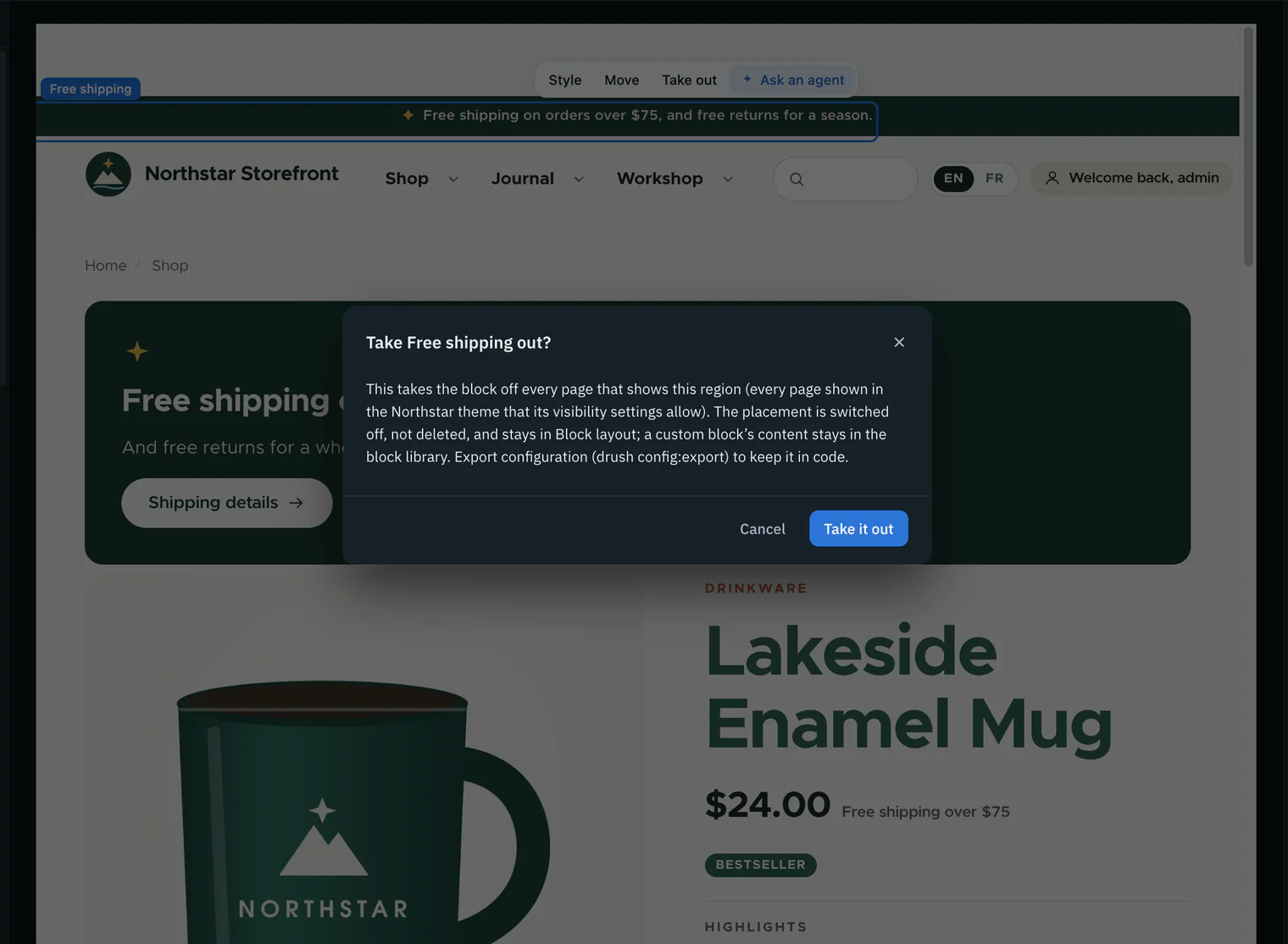
Answer, if it asks
Out of anything shared (a region’s blocks, a menu, a template, a synced pattern, a reusable block) it says where it shows and what stays, and asks first; Cancel saves nothing. Out of one page’s own content it is saved at once, as a new revision where the site keeps them.
Undo, if you need to
The status line says what was taken out and what stays, with Undo. The page reloads and is read back.

| What you take out | What happens | What stays |
|---|---|---|
| A Drupal block placement | Switched off, as its own form does it | The placement, in Block layout; a custom block’s content, in the block library |
| A Drupal menu link | Switched off in the menu, not deleted | The link itself |
| An item of a reference field | Only the reference goes | The content, media or file it pointed to |
| A Layout Builder component | Only the component goes from the layout | The content, media and reusable block content it showed |
| A WordPress block in a post, template or part | Only the block goes from the markup | The posts, media, reusable blocks and template parts it showed |
| A WordPress widget | Moved to Inactive widgets | Its settings |
| A WordPress menu item | Deleted; Undo makes it again | The page it linked to |
It is refused where core would delete what the part showed: an inline block in a layout that keeps no revisions, or a file, image or owned reference on content that keeps no revisions. A menu link with links under it is refused too. A helper older than version 4 cannot say whether a part can be taken out, and Update the helper… is offered there.
Agents read it too
An agent asked for “a product card” will often write a new one. Every agent session Wanigan starts is handed the read-only live_library tool, so it can look up what the site already has and name a real component, block or pattern in its change.
- With nothing asked, it counts every kind and lists the entries.
- With
query, it keeps the entries matching every word; withkind, one kind: component, block, pattern or style. - With
id, it gives one entry in full: its props schema, slots, files, and how Wanigan pictures it alone. - The same list is the resource
wanigan://live/components, for an agent that reads resources rather than calling tools.
It reads only, and renders and saves nothing. Names and descriptions are handed over as data the site reports, never as instructions. Copy its id in an entry’s details gives you the exact id to put in a note. More in Build with an agent.
Reuse the site’s own card
Show the related products under this product with the theme’s own Product card (sdc:northstar:product-card), the way node--product--teaser.html.twig already does, not new markup. Read its props and slots with live_library first, and use the compact look.The agent receives Sent as a note on the chosen part (Tell an agent in the Inspector): the page’s address and width, the part with what made it, and its picture. The session also has live_library, so it can read the card’s props and slots itself.
Based on Tell an agent: CODE components/live/note-store.ts notesText; cli/mcp.ts live_library
Keys
What has been tried
In depth
Where the list comes from
- The live view asks the helper at
/_wanigan/componentson the site’s own address, through the live view’s session (so as the user logged in there), with the helper’s key. The request refuses to follow a redirect, so the key goes nowhere else. - The helper reads core’s registries only: on Drupal the single-directory component and block plugin managers; on WordPress the block type, block pattern and block style registries.
- It is bounded: at most 2,000 entries, and a props schema only while it is under 16,000 bytes. A cut list says “The helper listed the first 2,000; the site has more.” Malformed entries are dropped, not repaired.
- Left out on purpose, and counted under the list: components of a theme that is not the active one, and internal ones.
- Each entry’s id says its kind:
sdc:northstar:hero,block:system_branding_block,block:core/paragraph,pattern:fieldnotes/trail-card,style:core/button:arrow. - A library read in the last minute is used again, so pictures asked for one after another share it. Ask the site again reads it fresh.
- When there is no library it says why, in the same words everywhere, with the one thing to do: switch the live view on, choose the local site, install the helper (“The site helper is not installed, and the library is read through it.”), update it, or ask again when the site refused or did not answer.
How the pictures are made
- Each picture is the helper’s own render of the entry alone, on a route under
/_wanigan/piece/, loaded in a hidden window with the live view’s session. Only the site’s own pages load there. - It is rendered to be comparable: never throttled, one device pixel per CSS pixel, web fonts loaded, animations, transitions and the caret switched off, reduced motion asked for, lazy images loaded, the page settled. The whole piece is captured, not only what fits the window, up to 4,000 px tall.
- Up to three hidden windows render at once, and the panel asks for six entries at a time, newest in view first.
- On the Northstar demo, sixteen pictures took 7.3 s one window at a time and 2.8 s three at a time.
- Pictures are kept under
live-library/in Wanigan’s data folder, by project and by a hash of the definitions and their files. A new hash means something changed: everything is pictured again, and the older pictures are removed when the next one is kept.
How the search works
Core keeps no index of where a component, block or pattern is used, so the helper searches what the site has stored. It reads only, stops at ten seconds or 500 places, and keeps only addresses on the site itself.
| Drupal | WordPress | |
|---|---|---|
| It searches | A block’s placements in every theme; Layout Builder default layouts and each item’s own layout; inline block usage; configuration that depends on what a block shows. For a component, Drupal’s own Twig parse of the templates of the theme in use, its base themes and enabled modules. | Stored block markup, confirmed block by block with core’s block processor; the theme’s template and template part files; registered patterns; block widgets. Then whatever holds it, followed wherever that is used in turn: synced patterns, patterns, template parts and navigation menus. |
| Seen on the demo | Northstar’s components found in the templates that use them; reusable blocks as placements and in a landing page’s own layout. | Fieldnotes’ blocks in content, templates and patterns; a button style in nineteen places through synced patterns and a template part. |
What it says it cannot see
Each answer lists what no search of stored data can see. In the helpers’ own words, shortened:
| Platform | What the search cannot see |
|---|---|
| Drupal | Which pages a placement shows on: its visibility conditions are decided as each page renders. |
| Drupal | A block rendered from code: a template, a preprocess function or a module that builds it as a render array. |
| Drupal | A component chosen at render time (a template name held in a variable or picked in a preprocess function), placed from PHP as a render array, or included by its file’s path instead of its name. |
| Drupal | Which pages show a component: a template runs only where its theme hook and suggestions match. |
| WordPress | Blocks that Block Hooks insert as a page renders. |
| WordPress | Blocks a theme or plugin renders from PHP: a classic theme’s templates, do_blocks() on its own markup, a shortcode. |
| WordPress | Which pages show a template or template part: the template hierarchy decides it as each page renders. |
| WordPress | Revisions, autosaves and the trash. |
| WordPress | Where a pattern of more than one top-level block was inserted: WordPress keeps a pattern’s name only on a pattern of one block. |
| WordPress | Blocks that show a block style because it is the default: they carry no class to find. |
| WordPress | On a network of sites, the other sites. |
The rules behind a write
- An insert is checked against the page’s trace before it is sent: the place must exist, must take that entry, and the spot must be inside it. The window checks it as the main process does, so a place that does not take it is said before anything is asked.
- A library entry is placed through the trace’s palette: on Drupal, a block’s palette entry is
pal.b.and its plugin id; on WordPress, block types and patterns keep their library ids. - A removal is checked the same way: the item must be on the page, in a collection the helper says can have items taken out, and the helper’s own reason for refusing is said as it is.
- The first write into a save that runs code beyond core says whose code runs, once for each set of that code while Wanigan is open. On WordPress with core’s AI Client, it offers the same write without the AI Client, for that one save.
- If the site changed since the page was traced, the write is refused and says so.
- A change to configuration says how to keep it: on Drupal, export configuration (
drush config:export) to keep it in code; on WordPress, that it is saved in the database, not in the theme’s code. - Every write is read back after the page reloads, and one that changed nothing is said plainly.